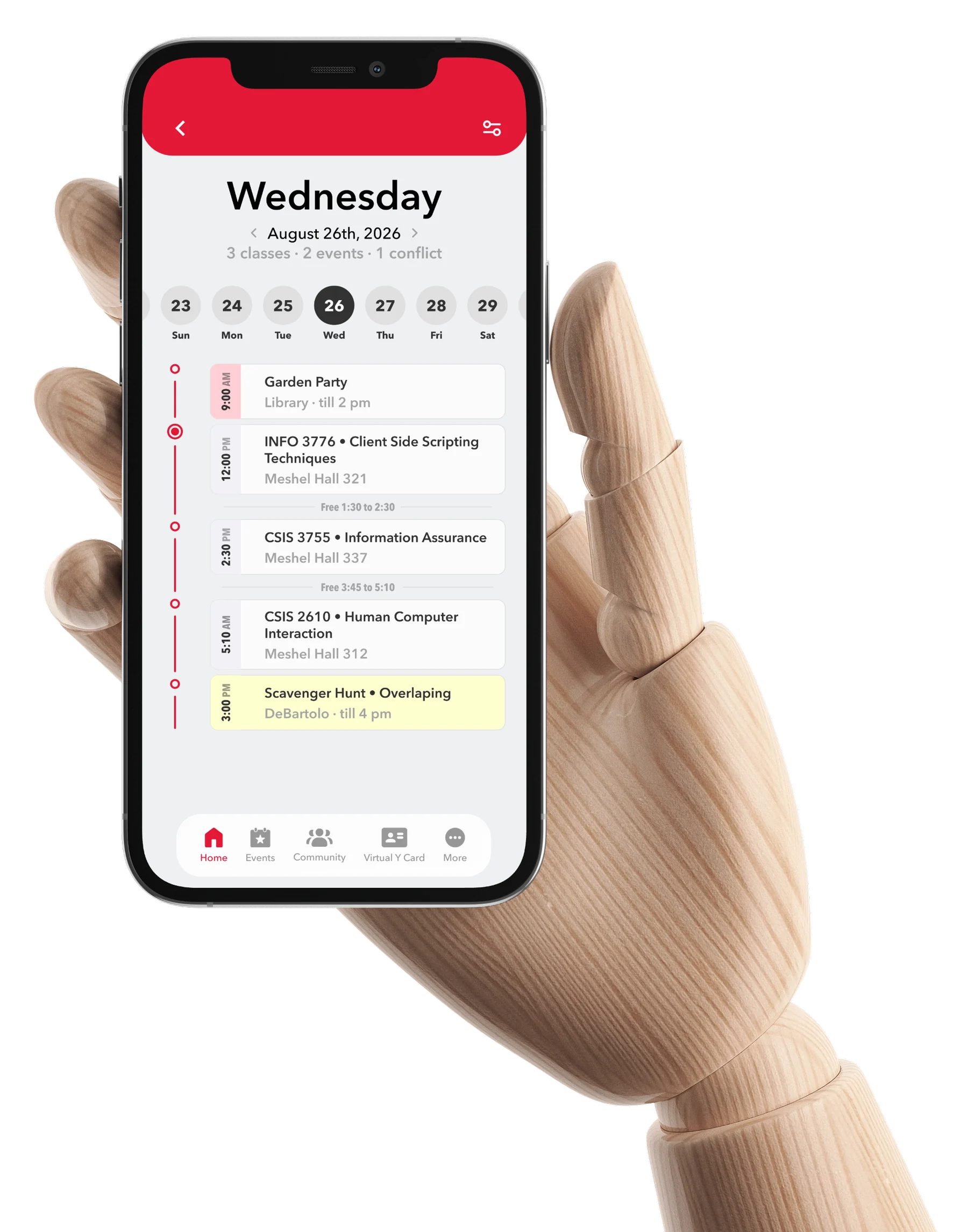
A campus app worth opening again.
A self-initiated redesign of my university’s app, after an update quietly removed the one feature students used every day.
Context
What the Y App is
The Y App is Youngstown State’s official app. It’s where students check events, explore clubs, and buy and sell in the feed. It also used to be where you checked your class schedule.
What I did
An update gave the app a fresh coat of paint and, somewhere in the makeover, dropped the class schedule. That was the main reason most of us opened it. Without it, you were back to the student portal and its slow multi-step login.
So on my own time I redesigned the app to bring the schedule back, without breaking the parts people already knew.
Final artifacts
The schedule, back where it belongs
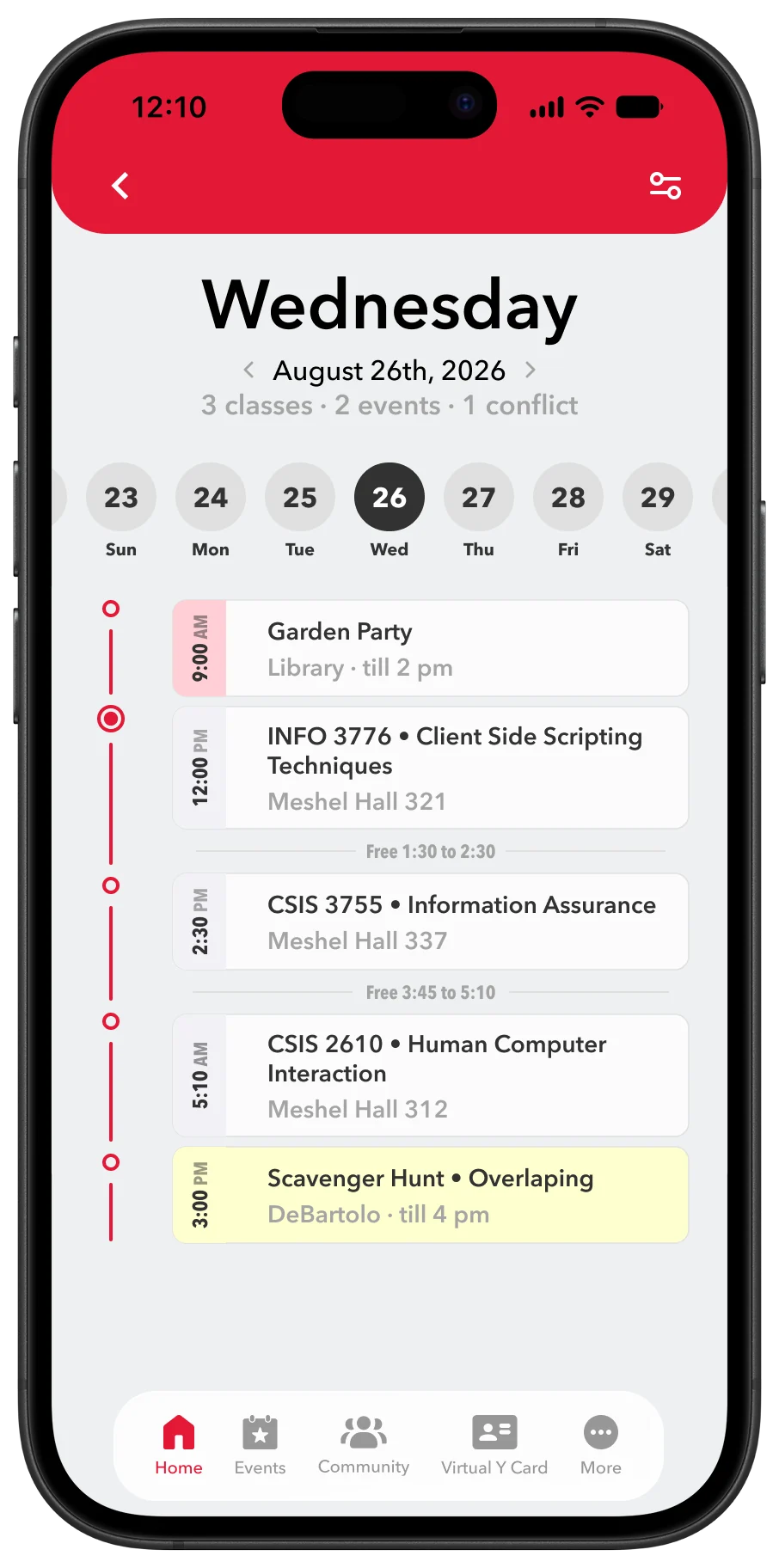
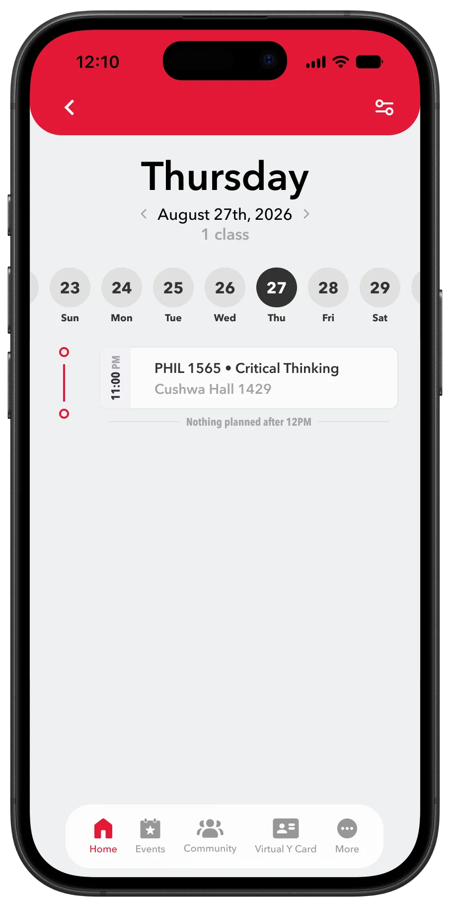
The rebuilt day view: your classes and events together, conflicts flagged, and the free time between classes. This is the one screen the whole redesign is really about.
Key moments
The one thing everyone missed
I didn’t just assume people were annoyed, I asked. Coworkers, friends, people around campus, same answer every time: bring back the schedule. It used to be right there, and the update took it out.
Turns out I wasn’t the only one refreshing the portal at 8am.
A schedule you can actually read
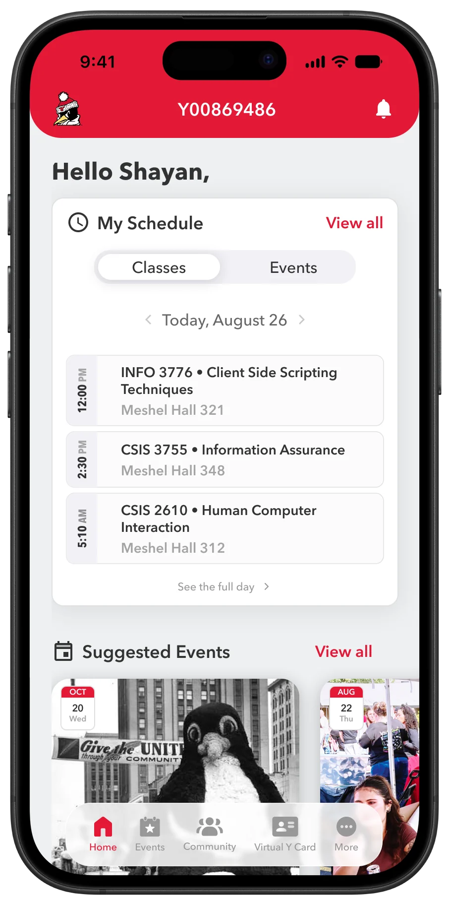
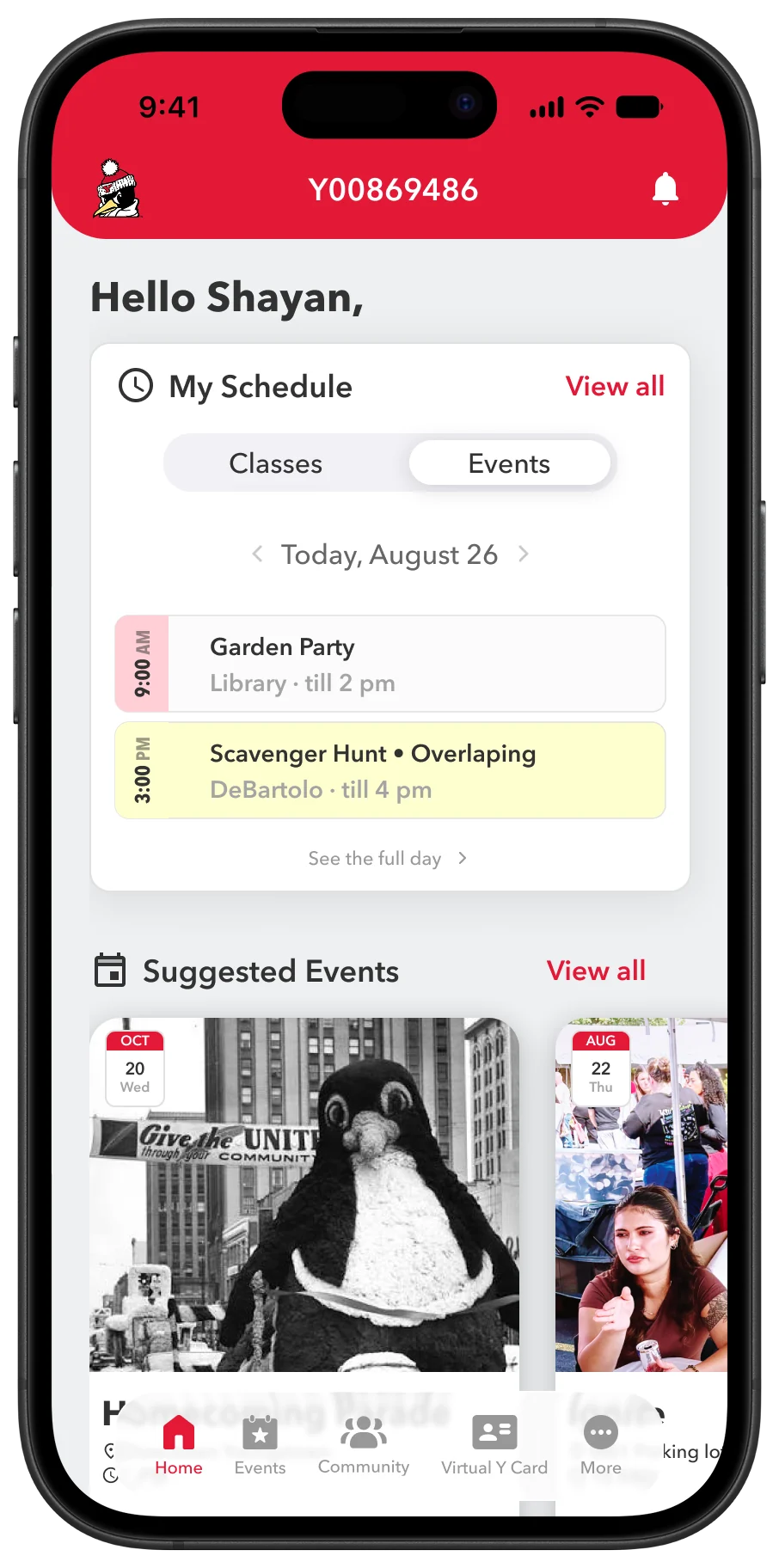
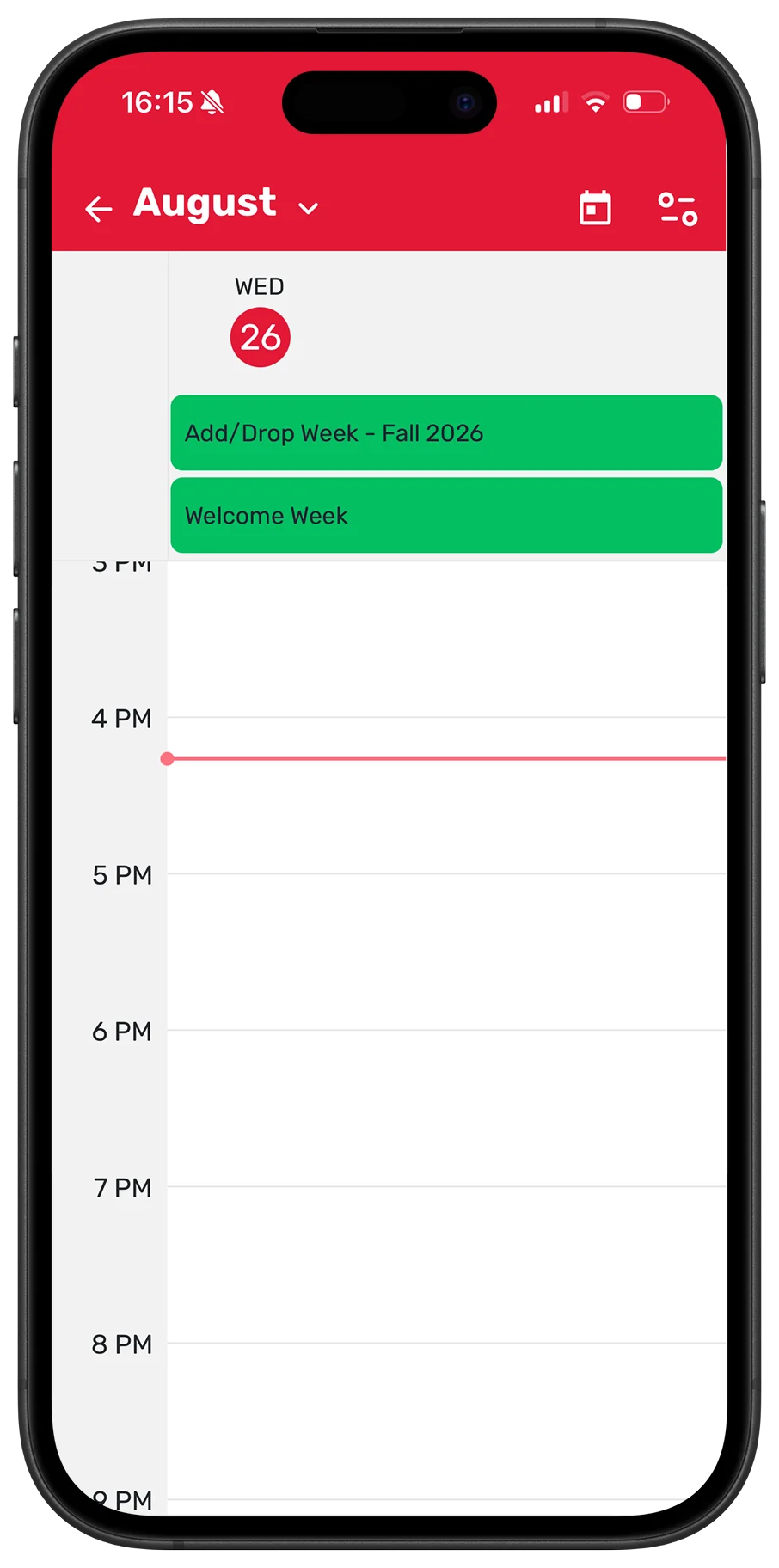
The old “view more” page was a long, empty scroll with filters nobody used. I looked at how calendar apps lay out a day, then rebuilt it: a Classes and Events toggle, a timeline that flags conflicts and marks where you are in the day, and the free time between classes so you can plan around it.
I kept the rest of the app familiar on purpose, so I fixed what was broken without making everyone relearn it.
Small changes, big difference
A few smaller fixes went a long way. I swapped the dated navbar logo for Pete, our mascot, and pulled your Y number up top so it’s easy to copy or show. I modernized the bottom nav to current iOS and cleaned up the spacing and icons.
The whole thing is wired up in Figma, so I could hand it to friends and my supervisor on a phone and let them use it instead of describing it. The Y number up top was actually a friend’s idea after testing, which is kind of the whole point of testing.
Reflection
Built in about two weeks, mostly on weekends and between classes. This was the first project I ran mostly on my own, on a problem I actually have.
The big lesson was restraint. The temptation was to redesign everything, but the fix people wanted was small and specific. I got a lot better at prototyping, and at knowing when to leave things alone.
Impact
It’s a concept, not shipped, but it’s fully prototyped and it fixes a real, daily annoyance for me and everyone I asked. It gives the app a reason to be opened again, and it saves students the portal login every single morning.